Why & How to Choose the Right Font for Your Copy

Your font can enhance your message… or detract from it.
Are you choosing the right font?
As a website copywriter (and former website designer), I’m a firm believer in the relationship between copy and design.
Great copy makes your design sound better. Great design makes your copy look better.
Both work together to create a cohesive brand message.
This is why I strongly prefer to collaborate with web designers, or at least for my clients to have a solid plan for how they will implement the copy I write for them.
How about you? Do you always keep the end format in mind when writing copy for your business?
You should. Because how your copy looks matters (almost) as much as how it sounds.
Keep reading to learn:
- What font psychology is (and why it matters to your copy)
- The three main types of fonts (and how they impact your message)
- Three questions to ask when choosing a font for your copy
What Is Font Psychology?
The reason your font affects your copy is because of font psychology.
Different fonts stir up different emotions and associations for your readers. As Sarah Hyndman, author of Why Fonts Matter, says in this TED talk:
“Typefaces can communicate with our subconscious. They leave our conscious brain to read what the words are actually saying.” –Sarah Hyndman, designer
Font psychology is so important, it can even alter the taste of jelly beans.
Yes, you read that right.
Hyndman ran a study in which 100 people were given jelly beans while looking at the following fonts:
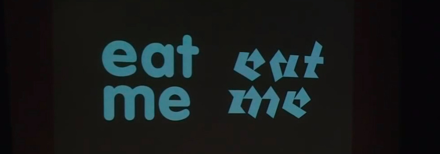
Here were the results:
- The jelly beans were rated 17% sweeter if displayed using the font on the left.
- The jelly beans were rated 11% more sour if displayed using the font on the right.
That’s just one example of how font psychology works and why it’s so important to choose the right font for your message.
Why Does Font Psychology Matter?
Understanding font psychology is important because it helps you:
- Elicit the emotional response you want from your readers
- Reinforce the point you’re trying to make
- Persuade your audience to take the action you desire
- Cultivate a stronger brand identity
So, you know why choosing the right font matters — but how do you pick the right one for your content?
The 3 Types of Fonts (& How They Impact Your Message)
There are hundreds of thousands of different fonts (or, more accurately, typefaces) in the world.
While there are various ways to classify fonts, most fonts can be boiled down to three main categories.
1. Serif Fonts
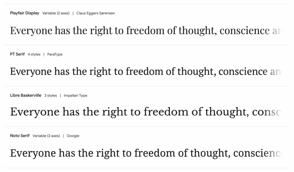
Serif fonts are the most traditional. They date back to the ancient Romans, who would carve small flourishes into stone inscriptions for better durability and readability.
The little “feet” at the bottom and top of each letter are now known as serifs.
Common serif fonts include Times New Roman, Garamond, Georgia, and Baskerville (which is what you’re reading now!).
A sub-category of serif fonts is slab-serif fonts, which look thicker and blockier. Common slab-serif fonts include Rockwell or Courier.
Modern publishers typically choose serif fonts for books and other physical media because they’re easier to read in printed form.
Brands often choose them to exude a sense of sophistication. Consider these brands that use serif fonts in their logos:
You may want to choose a serif font for your message if:
- Your brand is in a more formal or corporate industry, such as finance, law, insurance, or academia.
- You have an older or more traditional audience.
- You want to convey a sense of respect, authority, reliability, or trust.
- The copy will be printed.
2. Sans-Serif Fonts
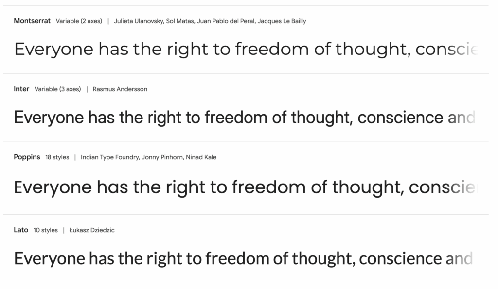
Once you know what a serif is, you can guess what a sans-serif font is: a font that has no serifs.
While sans-serif fonts date back to the early 1800s, they rose to popularity a century later. The clean lines of sans-serif fonts help reinforced the modern ideals of simplicity and functionality.
Today, they’re often used in digital applications, as the letters require less space and are easy to read on screens. Common sans-serif fonts include Arial, Helvetica, Futura, and Open Sans.
Brands often choose sans-serif fonts to exude a sense of innovation. Consider these brands that use sans-serif fonts in their logos:
You may want to choose a sans-serif font for your message if:
- Your brand is in a more casual or modern industry, such as fashion, startups, or tech.
- You have a younger or hipper audience.
- You want to convey a sense of friendliness, clarity, or efficiency.
- The copy will be read on a digital device or small display.
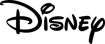
3. Script Fonts
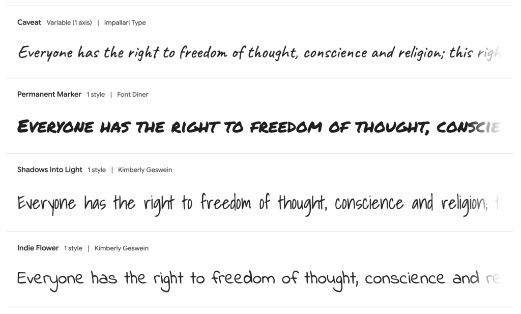
Script typefaces can be traced to the 18th century, though what they’re based on — human handwriting — can be traced back much farther than that.
Like anyone’s handwriting, script fonts vary drastically. Some feel youthful; others feel elegant.
Today, script fonts can be divided into two categories: formal or casual.
Formal script fonts resemble calligraphy, so they’re often used for wedding invitations or the like. Casual script fonts are less structured and more laid-back.
Common script fonts include Lobster, Brush Script, Lucida Handwriting, and Zapfino.
Brands often choose script fonts to exude a sense of familiarity or even fun. Consider these brands that use script fonts in their logos:
You may want to choose a script font for your message if:
- Your brand is in a more creative or commoditized industry, such as art, food, or toys.
- You have a more personal or distinct audience.
- You want to convey a sense of luxury, individuality, whimsy, or style.
- The copy itself is short (e.g., a logo).
3 Questions to Ask When Choosing a Font for Your Copy
Ready to choose the right font for your particular message?
Here are three questions to ask, so you don’t just pick a font that looks cool; you pick one that actually supports what you’re trying to say.
1. Does the Font Fit My Brand?
Hopefully, you have a brand style guide that outlines the visual identity of your brand.
If not, I highly recommend working with a brand designer (see our partnership with Cember Studio!). At the very least, you can use the tips in this post to choose fonts that fit your business as a whole.
Once you have your brand fonts, try to stick with them as much as possible. Don’t go rogue with a random typeface that would cause your designer to cringe.
This is why it’s helpful to have different fonts within your branding. For example, we use…
- Nineties Headliner: For bold, attention-grabbing headings
- Seriously Nostalgic: For quirky yet authoritative sub-headings
- Libre Baskerville: For editorial, easy-to-read body copy
2. Am I Using the Right Type Hierarchy?
Font type is one thing. Type hierarchy is another.
Typographic hierarchy is how we know which words in a message are most important. It’s what makes your copy readable (or not).
It includes lots of different elements…
- Typeface: What you might think of as “fonts” (e.g., Helvetica, Garamond)
- Size: How big or small the copy is (e.g., 12pt, 48pt)
- Case: The capitalization of the copy (e.g., lowercase, ALL CAPS)
- Weight: How light or heavy the copy is (e.g., regular, bold)
- Color: What shade the copy is (e.g., black, blue)
- Position: Where the copy is placed (e.g., at the top, beneath a photo)
- Alignment: How the copy is set horizontally (e.g., centered, justified)
- Spacing: How much space is between each letter, line, or paragraph (e.g., tracking, leading)
- Contrast: The visual distinction between any of these elements (e.g., black on white, small text beneath large text)
Each of these elements should be carefully considered when writing and publishing any piece of content.
3. Does This Font Feel Right?
Last on the list, but arguably most important: does the font feel like it supports your message?
Just like you can’t explain the chemistry with your partner, it’s hard to describe the emotional resonance of a font.
You just… know it when you feel it.
If you’re having trouble deciding whether a font feels right — or what about it feels off — ask someone else to give you their gut reaction. Bonus points if it’s someone in the audience you’re actually trying to reach with your copy.
Sometimes, all it takes for your message to hit home is to ensure your visual design aligns with your brand voice.
Learn More About Brand Messaging
We’re ALL about brand messaging here at Quotable Copy…
- Learn why you need clear brand messaging as a creative entrepreneur
- Discover the simple brand messaging strategy every business needs
- Grab our free magazine to create a brand voice you (and your audience) love
You can also learn new tips every week by joining our copywriting newsletter, The Weekly Wink!