OUr signature service
Allow us to craft your website copy, long-form sales page, launch email sequence, ad copy, or other need-it-now copy needs.
Free download
How strong is your brand voice? If you aren't sure, this guide is for you. Download our gorgeous, 20-page magazine to learn our secrets to writing with style.
VIP Day
Brand Voice Magazine
[ Tell Me More ]
[ Download Now ]
New!
How's your website really doing? Let's find out. Get the actionable tips you need to optimize your site (read: convert more clients).
Website Audit
[ I'm Intrigued ]
BY Sarah Klongerbo
Hello! Thanks for making this page a pitstop on your web-browsing journey. Please, stay awhile! We've got plenty of reading material to help you pass the time—and enhance your brand & copywriting while you're at it.
Follow @quotablecopy
[ Meet Our Founder & Editor In Chief ]
Grab the Brand Voice Magazine!
[ Download The Copy Edit ]
keep learning ABOUT:
tools & systems
STRATEGY & SALES
business & branding
copywriting & editing
productivity & life
Get Weekly Copywriting Tips!
[ Join The Weekly Wink ]
Use Type Hierarchy to Optimize Your Website Copy for Conversions
Want to make sure your website copy actually gets read?
One of the best ways to improve the readability of your copy — and your website user experience (UX) in general — is to choose the right typographic hierarchy.
Here’s what that is and why it’s so important for your website (or anywhere your copy and design intersect).
What Is Website Type Hierarchy?
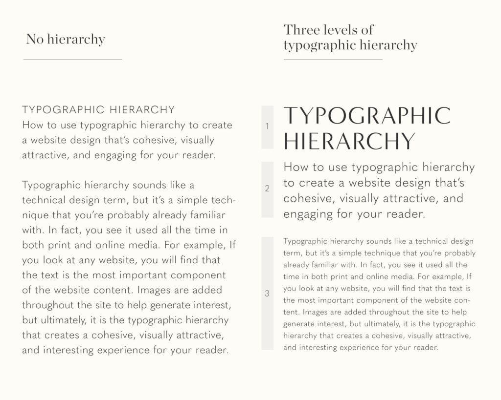
Typographic hierarchy is how we know which words on a webpage, blog post, or graphic are most important.
It’s what designers use to organize content so it’s easy to scan and read.
It’s the difference between these two examples:

Levels of Typographic Hierarchy
You can see why typographic hierarchy is so important, right?
Understanding it may be intuitive, but pulling it off takes intentionality.
First, you need to know the three main levels of typographic hierarchy:
- Heading: The most prominent text in the design
- Subheading: The next most prominent text, which supports the heading
- Body text: The least prominent text, which explains the heading / subheading in detail
When it comes to websites, there are actually six levels of headings, which can be defined by the following HTML tags:
- H1: The title of the page or blog post, which appears at the top
- H2: The subtitle, tagline, or next most important text on the page
- H3: The heading(s) to support the H2
- H4: The heading(s) to support the H3
- H5: And so on
- H6: And so forth
While you can have as many H2 – H6 headings as you want, you should have only one H1 per page for search engine optimization (SEO) purposes.
You probably want to limit your smaller headings, too, unless you’re creating an extremely in-depth piece of content that requires a complex organization structure.
How to Choose the Best Type Hierarchy for Your Website Copy
Once you know the levels of typographic hierarchy, you can choose the best ones for your brand and website copy.
If you’re working with a designer — and we highly recommend you do — they can do this for you.
If not, here are several elements and tips to consider when creating your own type hierarchy for your site.
Elements of Typographic Hierarchy
- Typeface: What you might think of as “fonts” (e.g., Helvetica, Garamond)
- Size: How big or small the copy is (e.g., 12pt, 48pt)
- Case: The capitalization of the copy (e.g., lowercase, ALL CAPS)
- Weight: How light or heavy the copy is (e.g., regular, bold)
- Color: What shade the copy is (e.g., black, blue)
- Position: Where the copy is placed (e.g., at the top, beneath a photo)
- Alignment: How the copy is set horizontally (e.g., centered, justified)
- Spacing: How much space is between each letter, line, or paragraph (e.g., tracking, leading)
- Contrast: The visual distinction between any of these elements (e.g., black on white, small text beneath large text)
5 Tips for Good Website Copy Hierarchy
- Lead with the most important content. Your H1 should be short, simple, and compelling. All other content should support it, logically flowing from most to least valuable info. (Journalists call this the “inverted pyramid,” which is a helpful visualization.)
- Follow the AIDA framework. AIDA stands for “Attention, Interest, Desire, and Action.” Start each page by grabbing your reader’s attention, then generating more interest about your topic, creating desire for your products or services, and finally urging your reader to act.
- Keep your paragraphs short. Online, people are 2X more likely to pay attention to short paragraphs than long ones. Limit each paragraph to no more than two or three sentences for optimal readability.
- Use plenty of visual cues. That means using all the typographic elements listed above. Play around with font color, size, and weight to create a website UX that’s both interesting and cohesive. Don’t try to do too much, though. Stick to two or three typefaces, a curated color palette, and consistent spacing so your site feels professional and clean.
- Optimize your site for SEO. Google likes to see only one H1 per page, as well as logical HTML tags for each subheading. Incorporate your target keyword wherever relevant, especially toward the beginning of your H1. But don’t “keyword stuff,” or your SEO — and your website visitors — will suffer.
Want Better Website Copy?
Typographic hierarchy helps make your web copy easy to read, but it won’t help you convert clients.
For that, you’ll need website copy that’s written to drive conversions. Which, BTW, is exactly what we specialize in!
Check out our copywriting services below, and reach out for a custom quote today.
[ Explore Our 1:1 Copywriting Services ]
Keep up the good reading
[ See All Articles ]
©2023 – 2026 Quotable Copy™


